

Project Overview
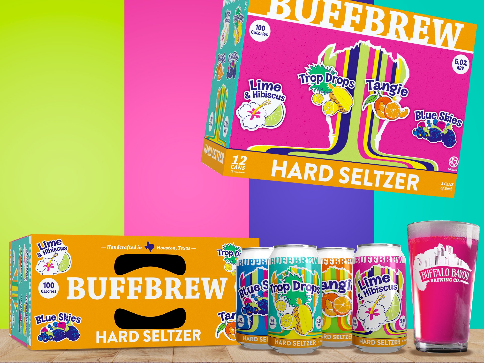
The goal of the Summer Street seltzer project was to introduce a new product vertical that stepped away from the established rustic and rugged Buffalo Bayou Brewing Co brand. It was actually the first product concepted and executed in the new building on new equipment. The unique thing about this seltzer is the vibrant colors of the individual liquids, as at that point hard seltzers were crystal clear without using natural ingredients. The volume package needed to stand apart from the usual seltzer aesthetic of white cans/labels and white packaging with subtle accent colors and photorealistic fruits. It needed to buck those trends while feeling right at home beside Best of The Best and IPA Party Pack boxes while evoking bubbly and electric energy.
Services Rendered:
Illustration
Graphic Design
Package Design
Marketing Strategy

Reworking Stakeholder Input
Summer Street launched with a C-Suite-driven design direction that, while well-intentioned, didn’t connect with consumers as strongly as we hoped. Developed by the brewery’s stakeholders as more of a finalized idea to tweak and make a reality from their sketches. With so many sweeping changes happening in the company, huge capital investments that needed to see results, and the overall directive to change the company brand while launching a new product, there was an anxiety and feeling of rush that was tearing apart process.
While sometimes it’s a job that you have full control over, sometimes you’ve got to understand the environment, meet the stakeholders where they are, and try to bring them home. Rather than treating this hobbled rollout as a setback, it became a turning point. Requiring consumer feedback and analyzing early market performance pointed us toward a bolder, more insight-driven solution that aligned more closely with Buff Brew’s evolving identity and the lifestyle of its audience.


“We wanted to take everything people loved about Buff Brew’s creativity in beer and inject it into a seltzer landscape that we revived from flat and boring.”
The redesign was rooted in the idea of “creative full flavor.” The typography was rounded and thick, chosen for its balance of playfulness and emphasis without feeling macho or exclusionary. This was deliberate: the brand needed to resonate equally with men and women, while also stepping away from the brewery’s previous rustic Texas-forward aesthetic. The color palette came directly from the fruit in each recipe, ensuring the cans communicated vibrancy and natural intensity without being mistaken for soda or juice. Naming the brand “Summer Street” connected it to Houston’s Sawyer Yards, the city’s largest collection of artist studios and the brewery’s own neighborhood. This grounding in place — and in Houston’s creative culture — gave the brand authenticity and local resonance. Finally, adding the striping and buffalo shaped cut out onto the can pulled directly from the massive “buffalo gate” art installation that visitors to the brewery walk through to enter the building. It spoke to the locals, while being symbolic enough that it wasn’t out of place on store shelves hours away from Houston.
From cans to retail, the design system expanded across every touchpoint. We developed a 12-can variety pack and created a full suite of in-store displays, point-of-sale assets, and large retail signage to drive visibility. Tap handles, merchandise, and event materials brought the brand to life inside the brewery, while digital and social assets ensured the launch carried online momentum. This wasn’t just a can design — it was a complete identity system built to flex across environments.


The impact was immediate. Relaunched with distributors, Summer Street quickly gained traction with retailers, expanding the original design’s shrinking shelf space at grocery chains, liquor stores, and bars across Texas. More importantly, the redesign signaled a shift in Buff Brew’s brand trajectory — helping the company evolve from “Buffalo Bayou Brewing Co.” into the more playful, whimsical, and consumer-led “Buff Brew.” Summer Street proved that when a brand listens, adapts, and embraces creativity, it can stand out in even the most crowded categories.